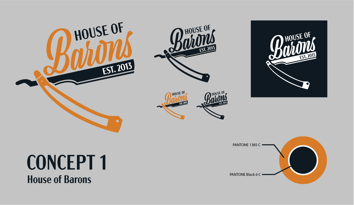
Redesign for the House of Barons logo and full branding to bring a cohesive look and feel to the company.
House of Barons has two locations in Ottawa, each location has a slightly different aesthetic and feel to the shop, and because of this they use multiple different styles of logos and brand looks.
One location is a classic barber shop both in look and feel. The other follows the more trendy conventions of barber shops, leaning towards an almost bodega, street corner style to its interior.
With this logo redesign and rebrand I set out to bring cohesion to House of Barons' brand. Finding the middle ground between the two locations and bringing them together into the logo you see.
Bringing classic barbershop and bodega barbershop together into a cohesive brand.
The process of sketching centred on the use of a straight blade razor as the focal point of the design. In keeping with the classic barbershop aesthetic, the choice of graphic imagery was able to be manipulated in various ways to create a cohesive look across all concepts, while still allowing for freedom within the design. The sketches were then narrowed down into two concepts that were further expanded on through sketching and creation within Illustrator.
The final concept was chosen based on its simple yet impactful look. The logo can be used in its full form or broken down into a word-mark for use in designs that have less breathing room.


